November 22nd, 2014
Designing with Words

A very confusing sign – Photo by Rob Stamm
Signs, guides, questionnaires and instructions are an important part of our daily lives. If they’re too confusing, we don’t know what to do – how to accomplish important things, like procuring health insurance or knowing when to park.
Much emphasis has been placed on the interactive and visual elements of product design, yet I’ve found that writing is the most powerful tool in a designer’s arsenal. Clarity of meaning is often the key ingredient that transforms a good product into a great product.
Writing is a design skill
Experienced designers will tell you that you can build an incredible product with minimal visual design, simple interactions and great interface copy. Interface writing covers all of the touchpoints you see in an app:
- Navigation
- Labels
- Buttons
- Descriptions
- Hints and tooltips
- Errors and alerts
- Form field placeholders
- Field validation
- Notifications
- Emails
- Configuration jargon
Your users want to accomplish something within your app. Your interface copy acts as a tour guide – it points out the unique attractions that make your app special. It also helps people avoid pitfalls. If you provide your users with a clear path, they’ll enjoy their stay within your app.
Say no to lorem ipsum
Lorem ipsum is a holdover from the advertising days, and was meant for mocking up static blocks of text to provide a word-count for copy. It typically doesn’t have a place in interaction design, because writing needs to be tested along with interactions – early and often.
I’ve found that designers who transitioned from the agency world struggle with interface copy, as copywriting is typically a separate area of responsibility. Not so with product design.
Writing is a highly-iterative part of the product design process. You’ll create the broad strokes while you sketch your UI – perhaps labeling an important button. Those written cues should become more refined as you work through the design problem. As you test your interface with others, the lack of clarity in your writing becomes especially evident.
You’ll find that your copy will deserve as much attention as your early interactions. I’ve found that often an interaction doesn’t test well because the instructions aren’t clear – rather than there being an issue with the interaction itself.
Lorem ipsum has no place in interface mockups, with perhaps one exception. It’s handy to simulate content length for user-generated content, which is certainly a part of the interface, but a piece in which the designer has no control. Even so, it’s better to provide natural language proxies, derived from your personas, to indicate how you think your system will be used.
Be specific and consistent
Focus on clarity when writing for your interface. Words have subtly different meanings, so it’s best to communicate succinctly and accurately instead of using common interface gibberish.
Specific language clarifies ambiguity, and draws out issues within the UI:
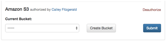
What does Submit mean?
In this case, it’s not clear what Submit is supposed to do. It seems important and risky to click. Did the designer mean to say, “Save and Finish” or perhaps, “Go to Step 2”?
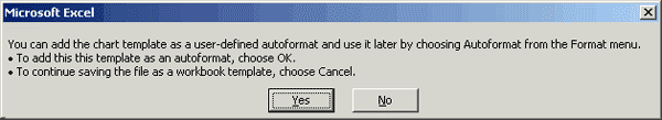
OK isn’t OK
What a loaded word! It might mean Save? …or perhaps it means Close? …or maybe Cancel? The user has no idea and must stop to think about the implications of “OK” and “Cancel”.
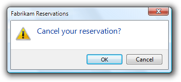
Does Yes Mean OK?
This is a legendary error message. Does Yes mean OK? Does No mean Cancel, or does it mean Yes? I’m still amazed that this messaging made it through QA.
QA your language
Before shipping your product, verify that your nomenclature is consistent across your product. Categorize interface language by action (“new user,” “save widget,” “new photo” etc.) and make a list of the variations used throughout the application. You’ll immediately see where you need to simplify your language and choose consistent nomenclature.
Be kind, not clever
Beware of being too clever in your interface. I’ve seen quite a few interfaces recently that attempt to establish a “brand personality” by using vague, folksy language. This becomes problematic when it obscures meaning.
Enterprise, jargon-filled interfaces go too far the opposite direction – they certainly aren’t clever… and they definitely aren’t clear, kind or human either.
How does it make your customers feel when they’re told:
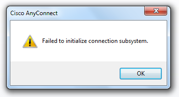
Incidentally, this occurs when Internet Explorer is set in ‘Work Offline’ mode.
Interfaces are conversations with your users. You’re either asking someone a question or asking them to do something. Focus on what your users need at this moment. Think about the implications of your words and whether they feel natural. I’ve found that it helps to read my instructions and descriptions out loud. If my phrasing doesn’t sound like natural conversation, I’m going to re-write it.
As a rule, shorter is usually better. Find the most succinct way to communicate your message. This exercise prioritizes clarity and purpose. I prefer to write in a conversational tone – but there’s a fine line between friendly and ambiguous. Software is hard to understand, and it’s the designer’s job to strike a balance.
Ask the right questions
Writing input forms is similar to interviewing someone. If you’re writing for an emergency room admissions system, an insurance company or a social network, these interviews become intensely personal. Think about the way you ask for personal information in real life. You don’t just jump in, right?
I suspect you begin the conversation by establishing trust. Before writing for a form, ask yourself the same questions that a customer might ask:
- Why do you need this information?
- How would I feel about providing it?
- Does providing this information get me what I need?
- Can I get what I need without providing information?
- What happens next?
Customers deserve to know the answer to all of these questions before filling in data, so spend time anticipating, testing, and clarifying potential questions in your descriptions.
Provide guideposts
In software, there’s a host of things that can sidetrack users. Validation checks, dropped connections, errors in data entry and issues with credentials are “interface traps” that prevent your users from accomplishing their goals.
Put on your tour guide hat. Anticipate potential traps and provide guideposts that helps users to avoid them. For instance, if you require a certain combination of characters for a password, check off those characters as your user types:
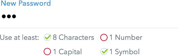
Use interactive cues to help users avoid errors
Anticipate the Unexpected
Encountering errors is unavoidable. Good error messages anticipate unexpected issues, and provide three things:
- What went wrong
- Why it went wrong
- Clear actions that you can do next
Instead of displaying cryptic errors when an unexpected bug is encountered, provide a means for the user to report the problem, or indicate that it has been logged:
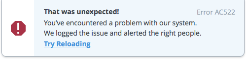
Catch unexpected issues and offer a way out
Tell them why
Instead of leaving your customers guessing, tell your users why they received an error. The error message should guide your users towards the right solution. Don’t blame your users for making a mistake. It’s our job as designers and developers to anticipate (and test for) pitfalls, then help our users both understand and avoid the issue in the future.
This error message (originally written in 1988) is fantastic – it provides constructive troubleshooting tips and connects the users with a real person who can help:
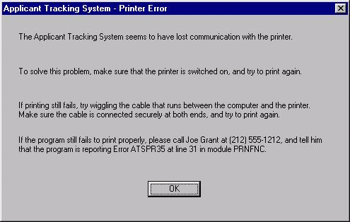
An uncommonly helpful error message – via Michael Bolton
Provide clear actions
Can you provide your user with an alternative that improves their circumstances? Facebook’s mobile app allows you to post even without an internet connection. This delightful feature isn’t expected behavior for an offline app, so the error message transitions rotates to show the issue and the resolution – all without obscuring the still-usable newsfeed (which was cached earlier):

A smart use of space and a cue for an unexpected action
Making it better
Your interface isn’t going the be perfect when you go out the door. Spend time with users, and watch their reaction to your messaging. Look for unanticipated behavior – and the assumptions that you’ve made because you designed your system. Before redesigning an interaction, test variations of messaging. The little details add up, so don’t be afraid to test action words, labels, buttons and icons. After all, these are typically the easiest things to change from build to build.
Always keep an eye out for refinements. Strive for clarity, purpose and delight.